Typography is more than just the art of arranging letters and words; it’s a powerful tool that shapes our perception of spaces and communicates messages in the built environment. Let’s explore how this design discipline enhances our world, from its history to its modern applications in placemaking and signage.
The History of Typography: From Scrolls to Signs
The history of typography stretches back over 5,000 years to the earliest written languages and alphabets, which transformed abstract symbols into structured forms of communication. For much of history, typography was confined to paper or parchment, accessible to a select few who were literate. However, its evolution took a monumental leap in the first century A.D. when typography began to appear in the environment.
Environmental typography marked a shift from personal to public communication. Carved into stone or cast in metal, it allowed messages to transcend physical and cultural boundaries, promoting large-scale literacy and technological advancements in mobility and communication. Whether on Roman milestones or medieval town signs, typography became a means for people to navigate and comprehend their surroundings.
Typography and Placemaking: Shaping Environments
Placemaking is the art of creating spaces that feel meaningful, welcoming, and functional—and typography plays a pivotal role in achieving these goals. Through thoughtful design, it can:
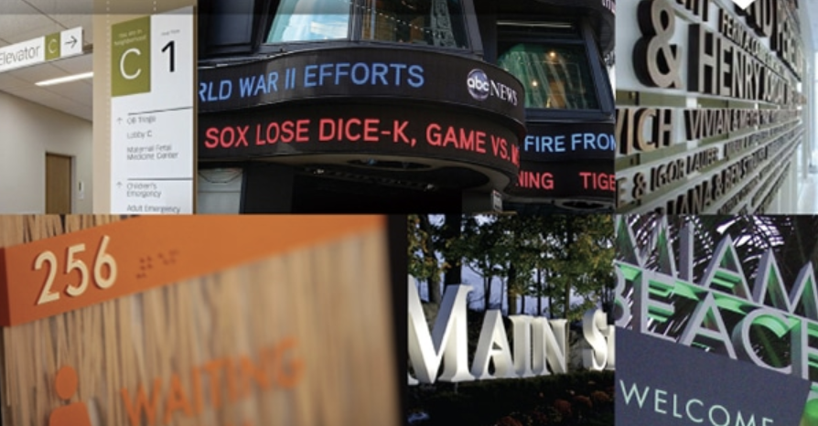
- Define Identity: Distinctive fonts and layouts help reinforce the character of a place, from urban landmarks to neighborhood parks.
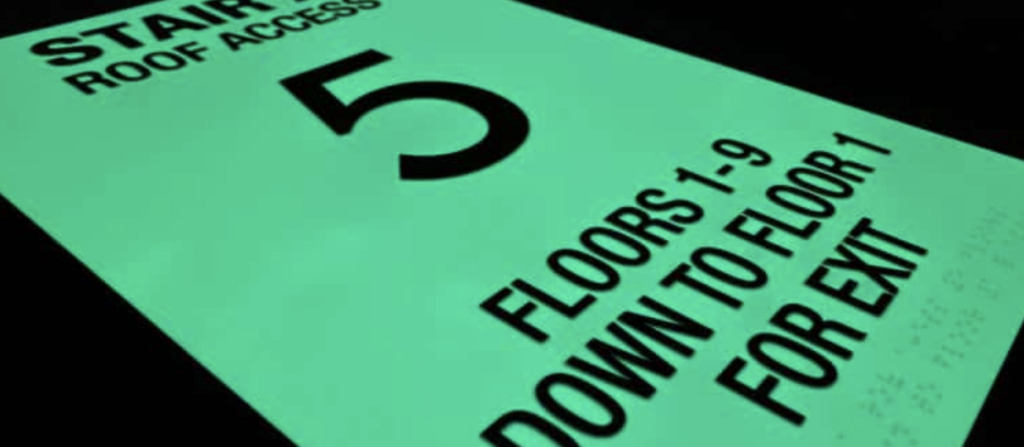
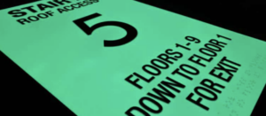
- Improve Wayfinding: Clear, legible typography ensures that signs provide essential guidance, enhancing the user experience in public spaces.
- Create Emotional Impact: Bold typefaces can evoke energy and vibrancy, while classic serif fonts might instill a sense of tradition or elegance.
In urban settings, typography helps translate abstract ideas about a community into tangible visuals, making spaces more engaging and memorable.
Typography in Signage Design
Signage is one of the most visible applications of typography in the environment. Signs are not merely functional objects; they are a key element in the visual language of a space. The best signage combines aesthetic appeal with practical usability, which requires:
- Selecting the Right Typeface: Fonts must balance readability with style. Sans-serif fonts like Helvetica are popular for their clean lines and clarity, especially in modern designs.
- Scaling for Visibility: Typography on signs must be sized appropriately for the distance and speed at which it will be read.
- Considering Materials: Typography interacts with the material of the sign, whether it’s carved into wood, etched into metal, or printed on glass.
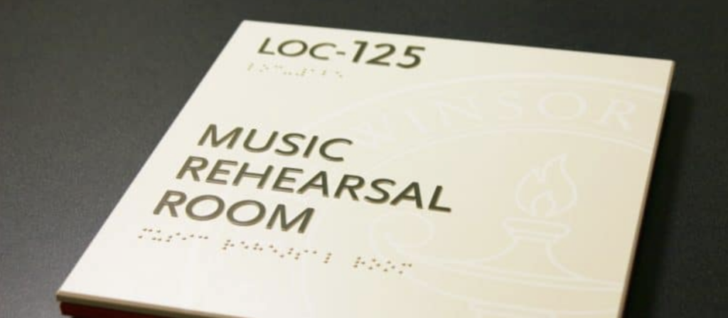
ADA-compliant signs are an excellent example of typography’s role in accessibility. These signs use tactile lettering and high-contrast color schemes to ensure readability for people with visual impairment.
The Future of Typography in Placemaking and Signs
As technology advances, typography continues to evolve, blending tradition with innovation. Digital screens, interactive signage, and augmented reality open up new possibilities for dynamic, responsive typographic designs. These innovations allow for real-time adaptation to user needs and environmental contexts, further enhancing the connection between people and places.
Moreover, sustainability is becoming a central consideration in signage. Designers are increasingly exploring eco-friendly materials and processes, ensuring that typography not only informs and inspires but also respects the planet.
Final Thoughts
Typography is an essential element of placemaking and signage, bridging the gap between design and communication. Its rich history and versatile applications demonstrate its ability to shape our environments and improve our interactions with the world. By understanding and embracing its principles, designers can craft spaces that are functional, profoundly meaningful, and beautiful.