When creating ADA compliant signs, two questions come to mind:
- Have you ever had any of your ADA signs rejected because they didn’t meet local, state, or federal ordinances?
- Have you ever noticed ADA signage in a building that fell short, like loose braille characters, incorrect spacing, or letters too small to read?
These questions highlight the importance of following the guidelines for ADA compliant signs. The current regulations, established in 2010, are essential reading for anyone specifying, designing, or fabricating these signs.
While ADA compliant signs are created daily, most problems arise from either a lack of knowledge or an attempt to prioritize design aesthetics over compliance. The Americans with Disabilities Act (ADA) requires businesses and governments to ensure accessibility for people with disabilities, and failing to follow these guidelines can result in costly fines.

ADA Compliant Signs: Violation Penalties
Non-compliance comes with significant penalties. The first violation can cost up to $75,000, with subsequent offenses reaching $150,000. Building owners often hold sign fabricators or designers responsible when signs don’t meet ADA standards.
As a fabricator, it’s crucial to ensure that your ADA compliant signs adhere to regulations—not just to avoid legal repercussions, but to create accessible environments for those with visual impairments. The following five essentials focus on character spacing, fonts, and other requirements to ensure compliance.
1. Fonts: The Foundation of ADA Compliant Signs
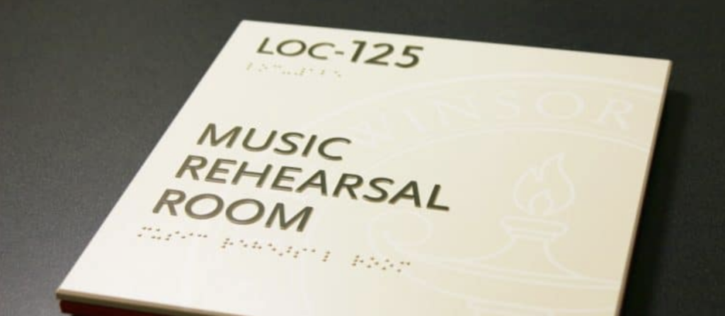
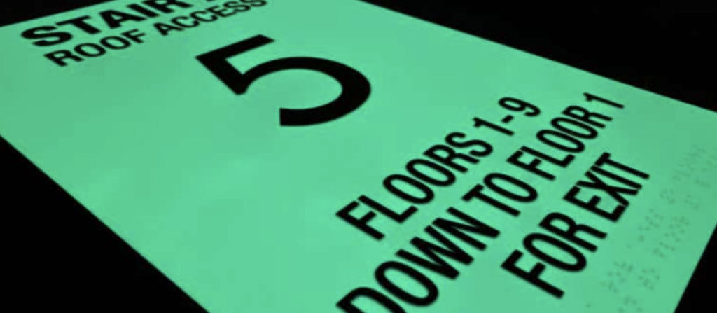
Choosing the right font is essential for ADA compliant signs. The ADA requires that all tactile lettering be uppercase, sans serif, and in fonts with specific proportions and sizes. This ensures that the signs are easy to read for people with visual impairments, especially when relying on touch.
For example, tactile characters on ADA compliant signs must meet these standards:
- Uppercase letters only
- Sans serif fonts (such as Helvetica)
- Character height between 5/8 inch and two inches
These specifications make it easier for visually impaired individuals to navigate spaces by touch. If you want to test it out for yourself, try this: Have your sign fabricator create two signs for you with just two or three words on each: one sign in a sans serif font like Helvetica and the other (with different words) in say, Times Roman. Be sure you aren’t told what the words are. Now, close your eyes and try to “read” the word with your fingers. Which one was easiest for you to “read” with your fingers?
2. Kerning: Proper Spacing for Accessibility
Kerning—the spacing between characters—plays a crucial role in ADA compliant signs. The ADA mandates that there must be at least 1/8 inch between tactile characters, ensuring that the text is easy to read by touch.
It’s essential to remember that ADA compliant signs prioritize functionality over aesthetics. Even though certain fonts may look better with tighter kerning, maintaining proper spacing is necessary for accessibility.
This is pretty straightforward. What makes it a bit tricky is that some character pairs are naturally closer together, but to be ADA compliant, those character pairs need to be spaced further apart, making the spacing wider than normal.
So here’s the thing: ADA signs are intended to be effective for the visually impaired, not aesthetically pleasing to typographers. The 1/8” kerning minimum and character size rules (that’s coming next) can cause issues with the size of the sign. The simple solution would be to squeeze everything together to make the word fit on the sign. This, of course, is not compliant and makes tracing the letters with your fingers very difficult. Doubt this? Have your designer make some signs using “normal” visual kerning and ADA kerning, then close your eyes and try to figure out which words are being used.
The idea is that tactile characters help people with visual disabilities trace their fingers along the tactile letters and numbers to read the room’s name. The reason for this is that the number of people who can read grade II braille is low, so wider kerning and sans serif fonts are the practical solution.
3. Character Size: Finding the Right Balance
Tactile characters on ADA-compliant signs must be at least 5/8 inches high and a maximum of two inches. This ensures that the characters are large enough to be legible but not so large that they become difficult to read by touch.
If a sign includes both visual and tactile elements, the tactile characters can be as small as 1/2 inch as long as the visual characters provide the same information. This balance is crucial in creating effective ADA compliant signs.
The exception to this rule is the dual message sign, which is meant to provide the same information for sighted and visually impaired people. In such cases, tactile characters can be as small as 1/2” high. The ruling reads: “Where separate raised and visual characters with the same information are provided, raised character height shall be permitted to be ½ inch (13 mm) minimum.”
Between character size, height, and kerning, dual message signs can easily be produced that are inadvertently out of compliance, so be sure to pay attention to the rules.
4. ADA Braille Standards: Ensuring Compliance
Braille is a critical element of ADA compliant signs. The ADA guidelines provide specific instructions on braille dots’ size, shape, and placement. In the U.S., grade II braille is required, which uses contractions to save space and make the signs more readable for those who rely on braille.
In states like California, ADA compliant signs must also adhere to Title 24, including additional braille spacing requirements.
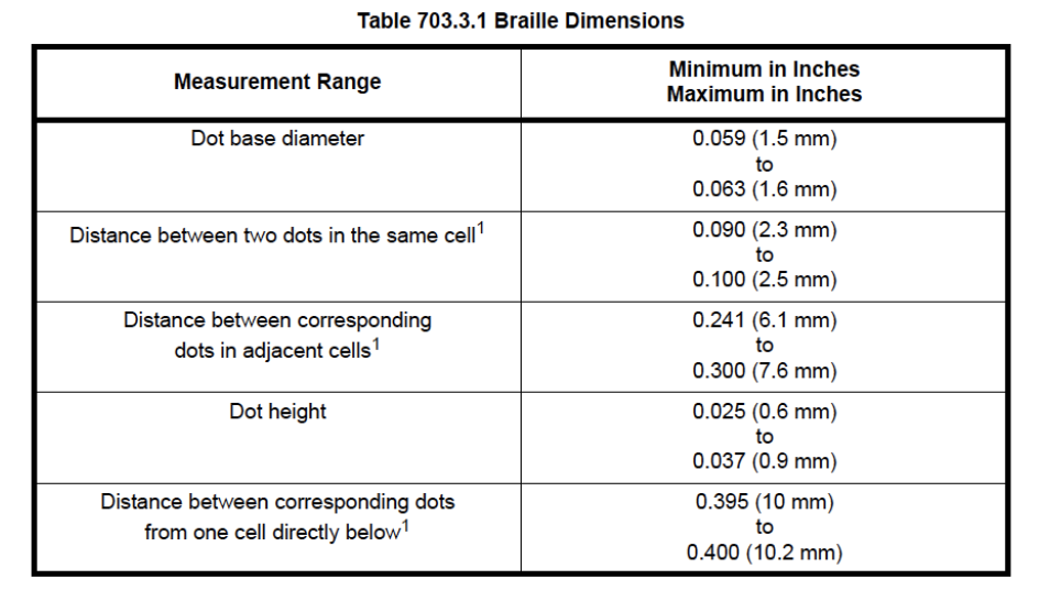
In the U.S., signs must have grade II braille, incorporating 189 contractions and short-form words. The braille’s condensed size is ideal for the limited space available on most signs.
Title 24 in California uses different spacing for braille. California braille, as it’s commonly called, uses Grade II braille with increased spacing between braille cells. Title 24 also has different requirements for the placement of the braille. For example, both the 2010 Standard and Title 24 require the braille to be at least 3/8” directly below the corresponding text. Title 24 sets the maximum distance of 1/2”. Both require the braille to be directly below the text, so you cannot put the braille to the right of the text. This is done so visually impaired people know where the braille cells are, so they don’t have to guess and try to find the cells they need.
The uppercase indicator before braille is not often required, but since many people are unsure when to use it, it is used frequently. The code states, “The indication of an uppercase letter or letters shall only be used before the first word of sentences, proper nouns, and names, individual letters of the alphabet, initials, and acronyms.”
5. Mounting Height: Correct Placement is Key
The mounting height for ADA-compliant signs must be between 48 and 60 inches from the floor, measured from the baseline of the tactile characters. Ensuring proper mounting height is straightforward but often overlooked.
703.4.1 Height Above Finish Floor or Ground. Tactile characters on signs shall be located 48 inches (1220 mm) minimum above the finish floor or ground surface, measured from the baseline of the lowest tactile character, and 60 inches (1525 mm) maximum above the finish floor or ground surface, measured from the baseline of the highest tactile character.
EXCEPTION: Tactile characters for elevator car controls shall not be required to comply with 703.4.1.
703.4.2 Location. Where a tactile sign is provided at a door, the sign shall be located alongside the door at the latch side. Where a tactile sign is provided at double doors with one active leaf, the sign shall be located on the inactive leaf. Where a tactile sign is provided at double doors with two active leafs, the sign shall be located to the right of the right-hand door. Where there is no wall space at the latch side of a single door or the right side of double doors, signs shall be located on the nearest adjacent wall. Signs containing tactile characters shall be located so that a clear floor space of 18 inches (455 mm) minimum by 18 inches (455 mm) minimum, centered on the tactile characters, is provided beyond the arc of any door swing between the closed position and 45-degree open position.
EXCEPTION: Signs with tactile characters shall be permitted on the push side of doors with closers and without hold-open devices.
Installers must be aware of this requirement to avoid non-compliance. Always consult local building inspectors when in doubt, as interpretations of ADA regulations can vary by jurisdiction.
Ensure ADA Compliant Signs
By following these five essentials, you can ensure your ADA compliant signs meet the necessary regulations. This not only protects your business from costly fines but also creates accessible spaces for all individuals. Familiarizing yourself with the ADA guidelines will allow you to become a valuable resource for building owners, architects, and designers, while ensuring your projects are fully compliant with all regulations.