Creating signs that comply with the Americans with Disabilities Act (ADA) is crucial for ensuring accessibility for all individuals, particularly those with disabilities. The ADA sign specs set forth specific requirements regarding the design, placement, and characteristics of signs that inform and guide individuals in public spaces.
For sign makers, understanding these specifications is key to creating effective, compliant signage. This guide will break down the important elements of ADA sign specs.
Importance of ADA Sign Specs
The ADA helps prevent discrimination against individuals with disabilities and provides equal access to public facilities. ADA compliance helps create environments accommodating everyone, empowering everyone, especially individuals with disabilities, to navigate their surroundings confidently.
For businesses and organizations, adhering to ADA standards is not just a matter of legal obligation; it reflects a commitment to inclusivity and accessibility.
Key Specifications for ADA-Compliant Signs
- Mounting Height and Location
Signs must be mounted within a specific height range. The baseline should be between 48 and 60 inches from the floor for most signs. This range is crucial to ensure that individuals in wheelchairs or those of different heights can easily read the signs.
Additionally, signs should be placed where they can be easily seen. Avoid placing signs where they might be obstructed by objects such as trees, plants, or furniture.
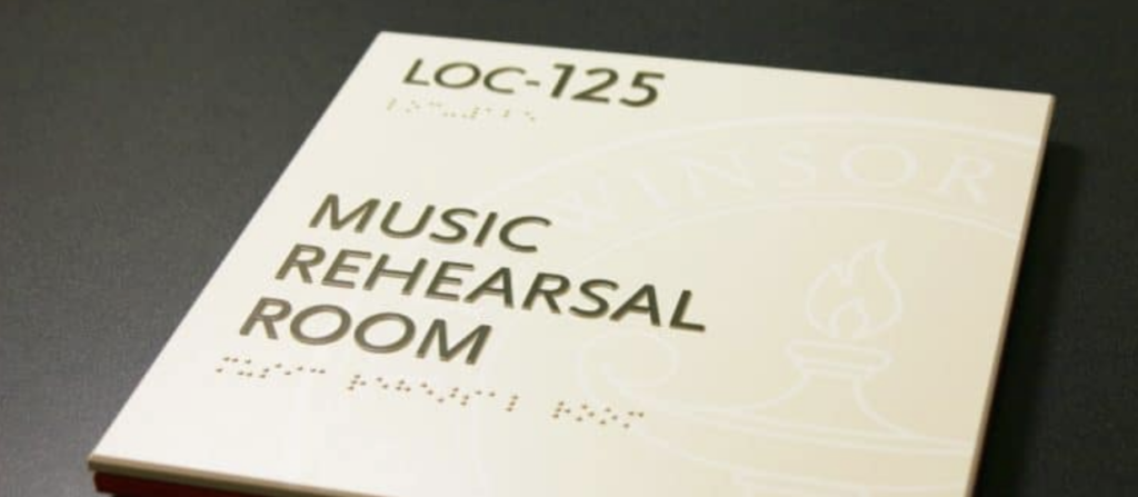
- Tactile and Braille Elements
ADA regulations require that signs incorporate tactile characters to accommodate individuals who are blind or visually impaired. This means that the sign should feature raised letters that touch can read.
Braille must also be included on signs that require tactile characters. It should be placed below the tactile lettering and adhere to specific grade and spacing guidelines to ensure readability.
- Font and Character Size
The preferred font in ADA sign specs must be simple, sans-serif, and easy to read. Standard fonts that meet these criteria include Arial, Helvetica, and Gothic.
ADA standards also govern the height of the characters. Uppercase letters must be at least 2 inches tall for signs mounted at 48 inches, with the size decreasing incrementally based on the distance from the sign. Lowercase letters should be proportionally sized and typically should not exceed 70% of the height of uppercase letters.
- Color Contrast
A high contrast between the sign’s background and the text is essential for visibility. Ideally, light-colored text should be placed on dark backgrounds or vice versa. Specifically, a contrast of 65% of a light reflectance value of the background to the colors of the pictogram, characters, and room numbers will become the stnadard. This contrast aids individuals with visual impairments in reading the sign more easily.
It’s also important to consider the material used for the sign. Materials should be matte rather than glossy to reduce glare, making reading more difficult.
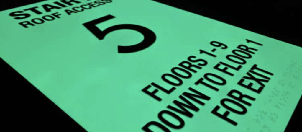
- Directional and Informational Signs
Directional signs, such as those indicating restrooms or exits, must provide clear and concise information. Incorporating symbols along with text can facilitate quicker recognition. The symbols should be standardized and recognizable for effective communication.
- Signage for Accessibility Features
Signs identifying accessible features (like accessible restrooms or parking spaces) must display the international symbol of accessibility. This symbol must be prominently displayed, providing immediate recognition and understanding.
- Durability and Maintenance
ADA sign specs highlight the importance of using durable materials that withstand environmental elements, particularly outdoor signage. This includes metals, plastics, and other robust materials that resist wear and tear.
Regular maintenance should be accomplished to ensure that the signs remain visible, legible, and properly mounted. Faded signage may lead to misunderstandings or confusion, compromising accessibility.
Testing for Compliance
After creating signs, it’s advisable to conduct a compliance check.
This can be done through a few simple tests:
- Position individuals with varying visual abilities before the sign to assess readability.
- Ensure that the tactile elements can be effectively felt and read.
- Double-check the sign’s location and mounting height to verify they meet ADA standards.
Making an Inclusive Environment by Implementing ADA Sign Specs
Work with us at Nova Polymers to create products that follow ADA sign specs. We’ll help foster an inclusive environment that accommodates everyone, regardless of their abilities.
By understanding and implementing these specifications, sign makers can ensure their materials meet accessibility standards while effectively communicating important information.
This fulfills a legal requirement and promotes a culture of accessibility and respect in our communities. Embracing these guidelines is not just a responsibility; it’s a commitment to ensure everyone has equal access to our public spaces.
Ensure ADA Compliance with Nova Polymers: Your Partner in Accessible Signage Solutions
Partner with Nova Polymers to create durable, high-quality ADA-compliant signs that foster inclusivity and meet all accessibility standards. Explore our innovative photopolymer materials and expert support to make your signage both compliant and impactful today.