Specifying ADA compliant fonts for architectural signage is more nuanced than choosing a “clean” sans serif. The 2010 ADA Standards define strict requirements for character style, proportions, case, and spacing on room identification and wayfinding signs. For photopolymer sign architects, overlooking these details can put a project at risk late in construction.
This guide breaks down what the ADA actually says about fonts, what has changed in current best practice, a working list of reliable font families, and common mistakes to avoid on ADA photopolymer projects.
What the ADA Really Says About Fonts on Signs
The ADA does not list specific font families. Instead, it defines how characters must be formed and spaced so they can be read tactually and visually by people with low vision.
For tactile characters on room ID signs (Section 703.2 and 703.3 of the 2010 ADA Standards):
- Characters must be uppercase only, with raised letters and Grade 2 Braille.
- Fonts must be conventional sans serif and not italic, oblique, script, highly decorative, or unusual in form.
- The width of the uppercase “O” must be 55 to 110 percent of the height of the uppercase “I.”
- Character spacing between the closest points of adjacent letters must be 10 to 35 percent of the character height.
- Character height is tied to viewing distance and must typically fall between 5/8 inch and 2 inches.
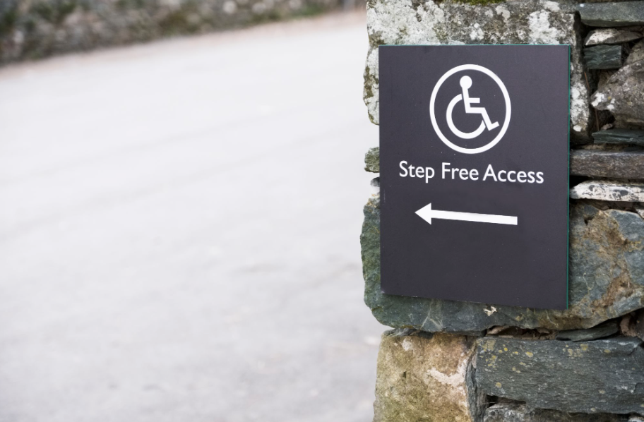
For visual characters on informational and directional signs (Section 703.5):
- Characters can be uppercase, lowercase, or a combination, as long as they follow conventional forms and are not italic, oblique, script, highly decorative, or unusual.
- Font proportions and spacing still need to follow the 55 to 110 percent width-to-height rule and appropriate letter spacing.
- Signs must provide high–contrast, dark and light, and a non-glare finish.
The key takeaway for architects is that ADA compliant fonts are defined by measurable characteristics, not by name alone.
A Working List of ADA Friendly Fonts for Signage
Because the ADA specifies font characteristics instead of named fonts, design teams tend to rely on families whose geometry and spacing consistently fall within those rules. When used correctly, the following fonts are generally considered safe choices for ADA compliant signage:
- Arial, Helvetica, and Verdana, which are widely cited as examples of accessible sans serif fonts that meet ADA and accessibility best practices when sized and spaced correctly.
- Tahoma, Calibri, Century Gothic, and Univers 55, which offer clear, open letterforms and weight options that support tactile and visual legibility.
- Frutiger, Gill Sans, Futura Book, Optima, Franklin Gothic, Myriad Pro, Avenir, and similar wayfinding families, which are often used in architectural sign programs and can meet ADA proportions when specified in the right weights and sizes.
Current accessibility practice also recognizes fonts specifically designed for legibility, such as Atkinson Hyperlegible and Roboto, as strong candidates for ADA compliant fonts on digital and printed components of a signage program, provided they respect the ADA’s character and contrast rules in physical form.
Since different weights and styles inside a font family can drift outside ADA proportions, it is important to verify stroke thickness, letter width to height ratios, and spacing in your exact layout rather than assuming the entire family is compliant.
Fonts and Treatments to Avoid for ADA Compliance
The ADA is explicit about what is not allowed on tactile and visual characters meant to convey important information. Architects should flag and avoid these issues before a sign package goes into production.
Treatments and styles that are not permitted on tactile and visual ADA characters include:
- Italic, oblique, script, stylized, or highly decorative letterforms that distort the conventional shape of characters.
- Condensed or ultra-wide styles that fall outside the 55 to 110 percent width-to-height proportional range.
- Extremely thin or hairline weights that reduce stroke thickness below roughly 10 to 15 percent of letter height, which can cause characters to disappear at typical viewing distances.
From a practical design standpoint, architects should also avoid:
- Using all caps display fonts that rely on tight kerning or overlapping shapes, which conflict with the ADA’s 10 to 35 percent character spacing guidance.
- Relying on outlines, shadows, or low contrast color palettes to create hierarchy, which can undermine the required light–dark contrast and non-glare surface finish.
- Mixing multiple decorative fonts in a single sign family, which increases the likelihood that at least one style will fall outside ADA tolerances.
For digital or environmental branding elements that do not communicate wayfinding or room identification, you have more flexibility, but any type directly tied to accessibility information should adhere to the ADA font rules above.
What’s New in ADA Font Practice for Architects
While the regulatory text in the 2010 ADA Standards has not changed, expectations about what counts as best practice have evolved alongside accessibility case law, WCAG guidance, and low vision research.
Trends that are shaping current specifications for ADA compliant fonts include:
- Greater emphasis on legibility for aging and low vision populations, which favors generous x-heights, open counters, and moderate stroke weights over minimalist thin styles.
- Better alignment between physical signage and digital accessibility standards, with teams coordinating font choices across architectural signage, interactive wayfinding, and websites.
- Increased scrutiny on contrast, background patterns, and glare, especially in healthcare, transportation, and civic environments, where the consequences of confusion can be serious.
For photopolymer sign programs, this means detailed coordination between architects, environmental graphic designers, and fabricators is more important than ever. Design intent documents should spell out not only the font family but also the exact weight, case, character height, contrast requirements, and mounting conditions to ensure that every sign can be produced within ADA tolerances.
How Nova Polymers Helps You Specify ADA Compliant Fonts
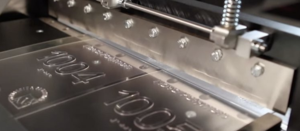
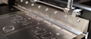
Even with an accurate spec, ADA compliant fonts still depend on precise fabrication. Nova Polymers photopolymer technology is engineered to reproduce tactile characters and Braille that meet ADA dimensional requirements consistently across large programs.
For sign architects, Nova Polymers offers:
- NovAcryl photopolymer materials that deliver durable, crisp tactile characters and Braille, helping maintain the character height, stroke thickness, and spacing required by the ADA over the life of the sign.
- A complete ADA signage ecosystem, including materials, equipment, and software workflows that support consistent reproduction of approved font families across both interior and exterior sign types.
- Education and technical support, including ADA signage webinars tailored to architects, that walk through sign specifications, font selection, and photopolymer best practices.
When you pair compliant font specifications with Nova Polymers photopolymer systems, you reduce the risk of late stage change orders, failed inspections, and inconsistent typography across multi phase sign packages.
Partner with Nova Polymers on Your Next ADA Sign Package
If you are planning a new wayfinding or room identification project and want to standardize on ADA compliant fonts, Nova Polymers can help you translate your design intent into a fully compliant photopolymer sign family, from font selection through fabrication details.
Contact Nova Polymers today to review your current signage standards, validate your ADA font choices, and specify photopolymer materials that will keep your architectural signs compliant, durable, and visually aligned with your brand.