A close-up of a bathroom sign featuring bold, sans serif ada complaint fonts that are easy to read and tactile for visually impaired individuals.

Choosing ADA Compliant Fonts: A Guide to Accessible Signage

A close-up of a bathroom sign featuring bold, sans serif ada complaint fonts that are easy to read and tactile for visually impaired individuals.

Navigating the Federal ADA braille signage guidelines can be challenging due to its complex and meticulous requirements. As a general rule, Nova Polymers simplifies the process for architects and fabricators to achieve 100% ADA signage compliance. This blog aims to empower sign manufacturers with the knowledge they need to ensure ADA braille compliance for each sign they produce, focusing specifically on the critical area of ADA compliant fonts.

Understanding the Importance of ADA Compliant Fonts

The rules for ADA compliant fonts on signage are strict, covering aspects such as character style, size, case, height, and more. Non-compliance can lead to significant fines of $75,000 for the first occurrence and then $150,000 for each additional non-compliant ADA violation. To help you navigate this landscape, we’ve outlined everything you need to know about ADA compliant fonts.

Font Style: A Common Compliance Pitfall

Font style is one of the most frequent areas where sign manufacturers fail to meet compliance. The ADA requires that all characters on signage be styled in a sans serif font. According to the ADA, “characters shall not be italic, oblique, script, highly decorative, or of other unusual forms.” This ensures that passersby can easily read and understand each sign from a distance. 

Additionally, all ADA compliant fonts must be uppercase to aid individuals with visual impairments. Uppercase fonts are easier to read and trace with fingertips. According to the ADA, all characters must be selected from fonts where the width of the uppercase letter “O” is between 55% and 110% of the height of the uppercase letter “I.”

Protecting Your Business: Handling Non-Compliant Font Requests

When dealing with customers, it’s crucial for sign manufacturers to protect themselves. If a customer insists on using a non-compliant font, ensure they sign off acknowledging that they were informed of the non-compliance. This step can safeguard manufacturers and fabricators from potential fines and issues arising from non-compliance.

Font Size: Ensuring Readability and Compliance

The ADA specifies strict guidelines for mounted signs’ font size. Currently, the ADA braille standard for character height ranges from a minimum of ⅝ inches to a maximum of 2 inches per line of text. This consistency helps make the text stand out and enables visually impaired individuals to read the sign without straining their eyes. However, manufacturers often make errors by not allowing enough room for both compliant Braille and tactile lettering, particularly with certain frame systems.

The exception to this rule applies to Dual Message Signs, which provide the same information for both sighted and visually impaired individuals. In these cases, font characters can be as small as ½ inch in height.
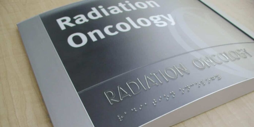
 

A hospital wayfinding sign displaying clear, ADA compliant fonts with large uppercase letters, ensuring easy readability for all visitors.

Character Spacing: The Challenges of Kerning

Kerning, or the space between characters, is another area where ADA braille guidelines are particularly restrictive. Character spacing should be measured between the two closest points of adjacent raised characters within a message, excluding word spaces.

There are two parts to this ruling depending on the type of cross-sections used:

  1. Rectangular Cross-Sections: Spacing between individual raised characters must be 1/8 inch minimum and 4 times the raised character stroke width maximum.
  2. Other Cross-Sections: Spacing between individual raised characters must be 1/16 inch minimum and 4 times the raised character stroke width maximum at the base, and 1/8 inch minimum and 4 times the stroke width maximum at the top.

All characters must be separated from raised borders and decorative elements by a minimum of 3/8 inch. Strict character spacing helps those with visual disabilities trace their fingers along each letter and number to read the sign.

Ensuring Compliance with ADA Compliant Fonts

Font styles, sizes, and spacing may seem like minor details, but they are critical to ADA braille compliance and can have significant consequences if overlooked. Businesses can face multiple ADA-related lawsuits or fines if a sign lacks the appropriate font style, character spacing, or size as required by the ADA.

Streamlining Compliance with Nova Polymers’ Workflow Manager

Nova Polymers’ Workflow Manager sign design software has all federal ADA sign specification requirements as well as California’s Title 24 building codes embedded in the software. This highly automated software ensures accuracy to the specifications of all font sizes, spacing, braille placement, and dome shape to meet federal sign standards, checks for non-compliance, including fonts, and meets federal standards.

Key Takeaways

The fonts used in signage are crucial for ensuring ADA braille compliance. Sign fabricators and manufacturers of all sizes should prioritize font style, size, and character spacing to avoid common mistakes and achieve greater confidence in their sign-making process.

Nova Polymers has the expertise to help you identify and resolve all your font-related issues. Contact us today for more information on our services.
Share This Post
Related Posts
ADA parking signs in a building’s lot.
April 15, 2025
Accessible Signage: How to Create Inclusive Environments Through Design
ADA parking signs in a building’s lot.
April 15, 2025
Designing ADA Parking Signs: Tips for Compliance and Visibility
A close-up of a bathroom sign featuring bold, sans serif ada complaint fonts that are easy to read and tactile for visually impaired individuals.

Choosing ADA Compliant Fonts: A Guide to Accessible Signage

A close-up of a bathroom sign featuring bold, sans serif ada complaint fonts that are easy to read and tactile for visually impaired individuals.

Navigating the Federal ADA braille signage guidelines can be challenging due to its complex and meticulous requirements. As a general rule, Nova Polymers simplifies the process for architects and fabricators to achieve 100% ADA signage compliance. This blog aims to empower sign manufacturers with the knowledge they need to ensure ADA braille compliance for each sign they produce, focusing specifically on the critical area of ADA compliant fonts.

Understanding the Importance of ADA Compliant Fonts

The rules for ADA compliant fonts on signage are strict, covering aspects such as character style, size, case, height, and more. Non-compliance can lead to significant fines of $75,000 for the first occurrence and then $150,000 for each additional non-compliant ADA violation. To help you navigate this landscape, we’ve outlined everything you need to know about ADA compliant fonts.

Font Style: A Common Compliance Pitfall

Font style is one of the most frequent areas where sign manufacturers fail to meet compliance. The ADA requires that all characters on signage be styled in a sans serif font. According to the ADA, “characters shall not be italic, oblique, script, highly decorative, or of other unusual forms.” This ensures that passersby can easily read and understand each sign from a distance. 

Additionally, all ADA compliant fonts must be uppercase to aid individuals with visual impairments. Uppercase fonts are easier to read and trace with fingertips. According to the ADA, all characters must be selected from fonts where the width of the uppercase letter “O” is between 55% and 110% of the height of the uppercase letter “I.”

Protecting Your Business: Handling Non-Compliant Font Requests

When dealing with customers, it’s crucial for sign manufacturers to protect themselves. If a customer insists on using a non-compliant font, ensure they sign off acknowledging that they were informed of the non-compliance. This step can safeguard manufacturers and fabricators from potential fines and issues arising from non-compliance.

Font Size: Ensuring Readability and Compliance

The ADA specifies strict guidelines for mounted signs’ font size. Currently, the ADA braille standard for character height ranges from a minimum of ⅝ inches to a maximum of 2 inches per line of text. This consistency helps make the text stand out and enables visually impaired individuals to read the sign without straining their eyes. However, manufacturers often make errors by not allowing enough room for both compliant Braille and tactile lettering, particularly with certain frame systems.

The exception to this rule applies to Dual Message Signs, which provide the same information for both sighted and visually impaired individuals. In these cases, font characters can be as small as ½ inch in height.


A hospital wayfinding sign displaying clear, ADA compliant fonts with large uppercase letters, ensuring easy readability for all visitors.

Character Spacing: The Challenges of Kerning

Kerning, or the space between characters, is another area where ADA braille guidelines are particularly restrictive. Character spacing should be measured between the two closest points of adjacent raised characters within a message, excluding word spaces.

There are two parts to this ruling depending on the type of cross-sections used:

  1. Rectangular Cross-Sections: Spacing between individual raised characters must be 1/8 inch minimum and 4 times the raised character stroke width maximum.
  2. Other Cross-Sections: Spacing between individual raised characters must be 1/16 inch minimum and 4 times the raised character stroke width maximum at the base, and 1/8 inch minimum and 4 times the stroke width maximum at the top.

All characters must be separated from raised borders and decorative elements by a minimum of 3/8 inch. Strict character spacing helps those with visual disabilities trace their fingers along each letter and number to read the sign.

Ensuring Compliance with ADA Compliant Fonts

Font styles, sizes, and spacing may seem like minor details, but they are critical to ADA braille compliance and can have significant consequences if overlooked. Businesses can face multiple ADA-related lawsuits or fines if a sign lacks the appropriate font style, character spacing, or size as required by the ADA.

Streamlining Compliance with Nova Polymers’ Workflow Manager

Nova Polymers’ Workflow Manager sign design software has all federal ADA sign specification requirements as well as California’s Title 24 building codes embedded in the software. This highly automated software ensures accuracy to the specifications of all font sizes, spacing, braille placement, and dome shape to meet federal sign standards, checks for non-compliance, including fonts, and meets federal standards.

Key Takeaways

The fonts used in signage are crucial for ensuring ADA braille compliance. Sign fabricators and manufacturers of all sizes should prioritize font style, size, and character spacing to avoid common mistakes and achieve greater confidence in their sign-making process.

Nova Polymers has the expertise to help you identify and resolve all your font-related issues. Contact us today for more information on our services.

Share This Post
Related Posts
ADA parking signs in a building’s lot.
April 15, 2025
Accessible Signage: How to Create Inclusive Environments Through Design
ADA parking signs in a building’s lot.
April 15, 2025
Designing ADA Parking Signs: Tips for Compliance and Visibility